Color theory is not magic
Choosing colors and color palettes is hard. Even more so because you will never ever please everyone. How we experience colors is complex and personal, even cultural, but we can aim to create science illustrations and posters that please most.
The method relied on by artists and graphic designers to make better choices regarding colors is called color theory. This is not a rigid scientific theory, but a method constructed and adapted out of the experience of many artists over hundreds of years. A common mistake is the assumption that color theory will automatically lead to a great color palette. This is not the case. It is a very useful tool, but applying color theory successfully requires thought and work.
In this blog we will discuss the concepts of color theory and describe this “thought and work” that is needed to take you one step closer to color success!
Color harmonies
Technically, “color theory” refers to all knowledge in existence on how colors and light work, but it is commonly used to refer to the principle of using color harmonies, which is also how we will use it in this blog. Color theory uses so called color harmonies to describe effective or interesting color combinations. Color harmonies are formulated around the relative positions of the colors on the color wheel. For example, a complementary color harmony uses the two colors that sit on opposite ends of the color wheel. Below you see an overview of the different harmonies indicated by the black lines. Later in this blog, we will discuss each harmony in more detail.

The color wheel
The color wheel is a way of representing colors in a circular format. The most basic color wheel is constructed using three primary colors, red, yellow, and blue (RYB), which as painting pigments can be blended to form secondary colors, orange, green and purple. For most of us this is the way we were taught colors in school, and it is a good way to know which pigments to mix to get a certain hue. However, when we talk about color as light, the primary colors are red, blue and green, not yellow. And when we talk about modern printing the primary colors are considered cyan, magenta, and yellow.
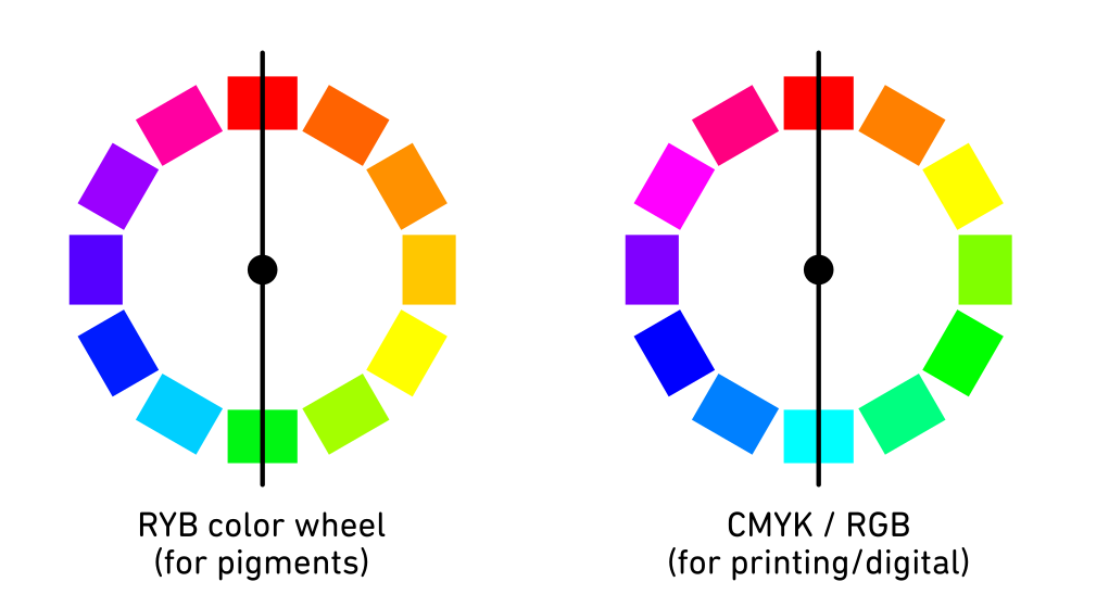
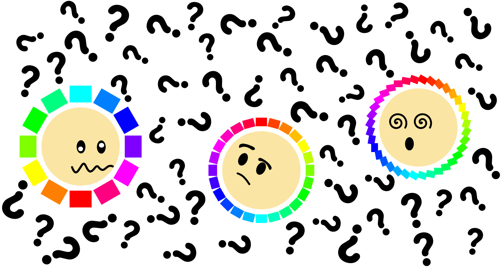
Different primary colors lead to different color wheels with different positions for the colors relative to each other. This might make it confusing when trying to find for example the complementary color for red…
Is it green? Or is it cyan?
The answer of course is that both cyan and green are great complementary colors for red.
Is it green? Or is it cyan?
The answer of course is that both cyan and green are great complementary colors for red.
Another ambiguity that affects the outcome of color theory is the number of partitions in your color wheel. This doesn’t affect the complementary pairs, but it does affect the other harmonies and will greatly expand the number of possible combinations available to you. This gets even more complex in digital illustration where we can work with an almost continuous color wheel with one hue for each degree (aka 360 hues). In the image below you can see how three differently partitioned color wheels lead to different color combinations for the split complementary color harmony. For the continuous color wheel, the split complementary harmony is impossible to differentiate from the complementary harmony.
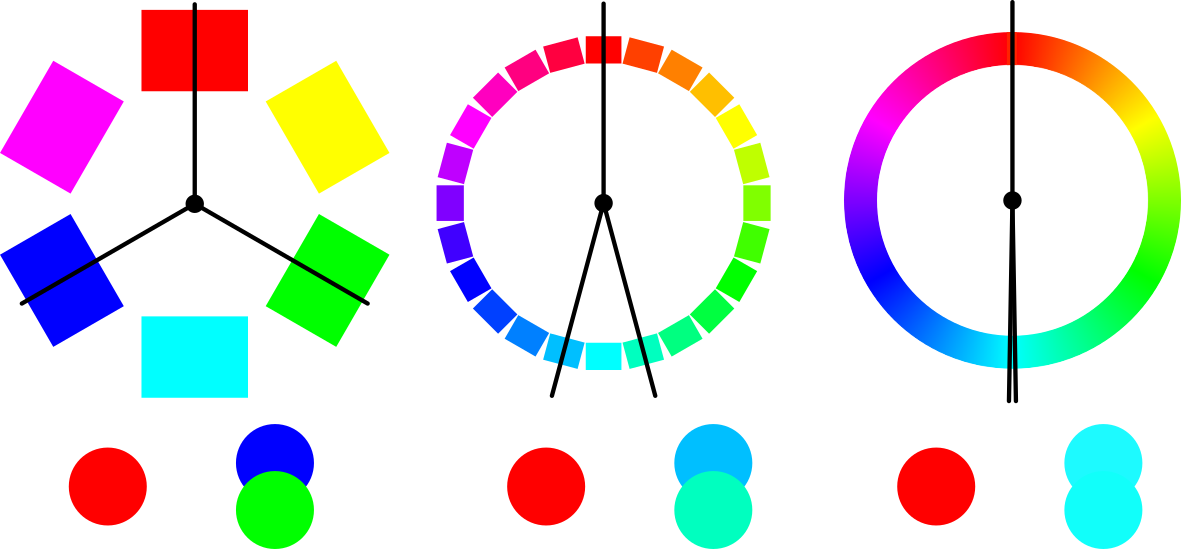
Color theory is ambiguous.
So, color theory is ambiguous, and results vary depending on your color wheel, its primary colors, and partitioning.
Then what should you do to get to good palettes?
Then what should you do to get to good palettes?
1. Function
Realise that not all harmonies are meant to be “harmonious”. Color harmonies have different functions, and you should pick a harmony based on the function you want it to fulfil in your design.
2. Use value and saturation
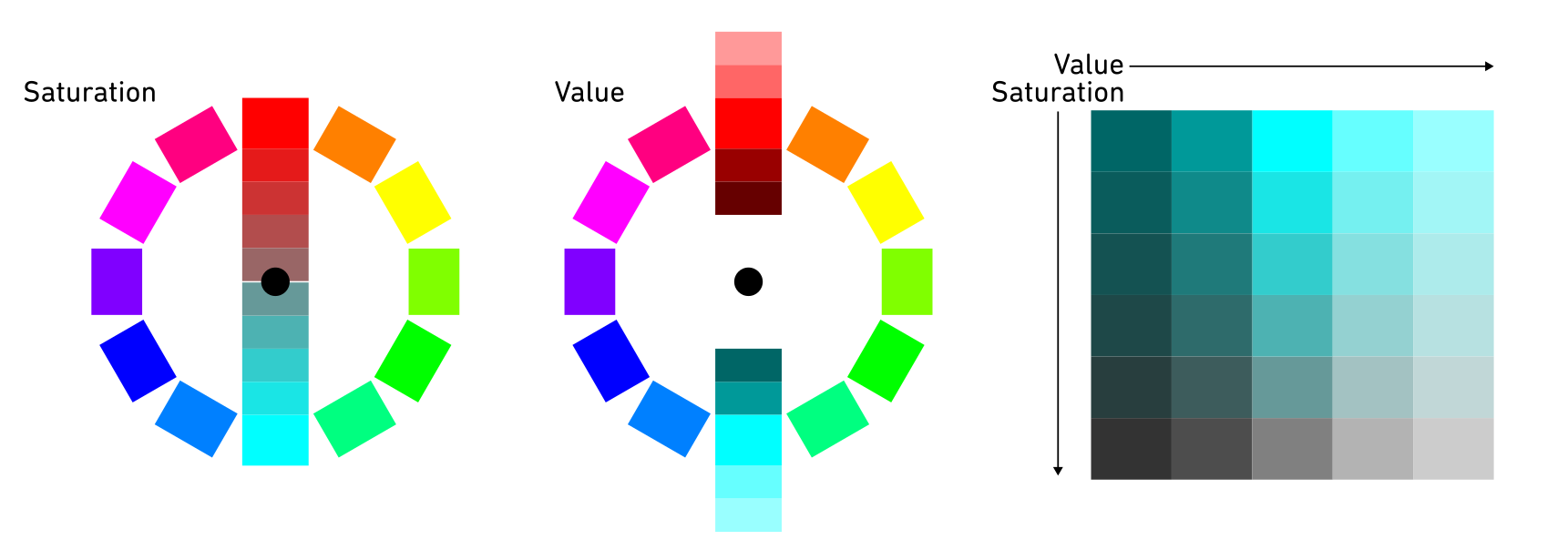
Although most color wheels are made up out of saturated colors, for each hue, a wide variety of saturations and values exist (see image below). The saturated colors are often very intense which is not appropriate for every design. Using the dimensions of saturation and value (“intensity” and “lightness/darkness”) to create a variety of light, dark, strong and soft colors within you chosen color harmony will give you greater freedom to find the colors suitable to your design.
3. Adapt ratios
You do not have to use each color in the same amount. And in fact, varying the ratios of the colors can enhance the function of a color harmony.
A simple example
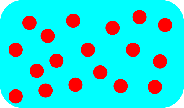
This is the red-cyan complementary color harmony. The red bubbles on the cyan background are uncomfortable to look at. In addition to that, the image looks quite uniform, what makes this image interesting, what should the audience look at?
So lets play with value, saturation and the ratios.
So lets play with value, saturation and the ratios.

In the new version to the right the cyan background has been darkened and the red of the dots is lightened a bit to make the contrast less jarring. Only one dot is left red, while the others are variations of cyan. This creates an interesting surrounding for that red bubble. The design is calmer and makes us curious, what is up with that red dot?
It is the same color harmony, but a totally different vibe.
It is the same color harmony, but a totally different vibe.
Color harmonies in more detail
So now that you have a better idea how to wield color theory, let’s have a closer look at each of the color harmonies and their functions, strengths and pitfalls.
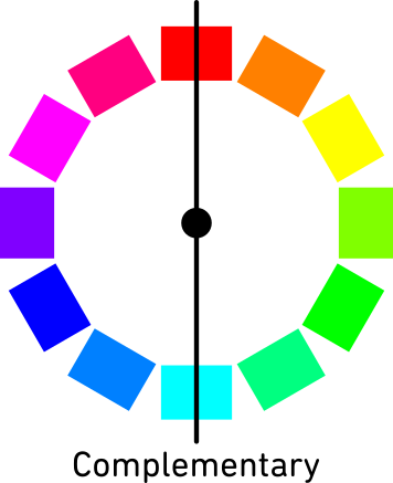
Complementary:
Two colors are complementary if they have the highest possible contrast in hue. Due to the way the color wheel is organized complementary colors sit on opposite ends of the color wheel which makes it easy to find a hue’s complementary hue. I find the name complementary colors a bit misleading, because it implies that the colors complement each other well, however not all complementary pairs are experienced as pleasing to the eye. “Contrasting colors” would have been a better name, since these color pairs experience the most jarring contrast when combined with each other.
Two colors are complementary if they have the highest possible contrast in hue. Due to the way the color wheel is organized complementary colors sit on opposite ends of the color wheel which makes it easy to find a hue’s complementary hue. I find the name complementary colors a bit misleading, because it implies that the colors complement each other well, however not all complementary pairs are experienced as pleasing to the eye. “Contrasting colors” would have been a better name, since these color pairs experience the most jarring contrast when combined with each other.
When used right, complementary colors can create interesting scenes, but when used wrong it can be uncomfortable to look at. In most cases, “uncomfortable” is not the purpose of our visual. A better way to use complimentary colors is to let one color dominate, use these colors in a 90/10 ratio rather than a 50/50 ratio. This will draw attention to wherever that 10% of the one color is.
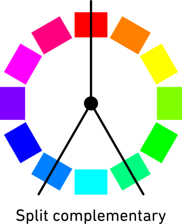
Split complementary:
This color harmony can be seen as a toned-down version of the complementary harmony. Instead of combining one color with its opposite, it combines one color with the two colors adjacent to its opposite on the color wheel. This results in a combination that has a pretty strong contrast but feels less jarring and more harmonious than the complementary color palette.
In addition, having two complementing colors allows for two things to be accentuated, while also showing they are different.
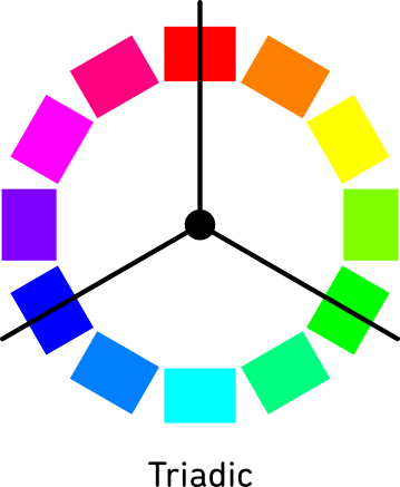
Triadic:
The triadic color harmony uses three colours that are equidistant on the color wheel, forming a perfect triangle. This harmony provides a vibrant combination of colors that have plenty of contrast but cause less discomfort than the complementary harmonies. Because of the equidistance, it is easier to balance this harmony and create a cohesive look for your design. Triadic color harmonies are usually used either in a 50-25-25 ratio or a 60-30-10 ratio. The first allows for a more dynamic look, where the second allows for a very clear hierarchy, which can be especially helpful when designing posters.
The triadic color harmony uses three colours that are equidistant on the color wheel, forming a perfect triangle. This harmony provides a vibrant combination of colors that have plenty of contrast but cause less discomfort than the complementary harmonies. Because of the equidistance, it is easier to balance this harmony and create a cohesive look for your design. Triadic color harmonies are usually used either in a 50-25-25 ratio or a 60-30-10 ratio. The first allows for a more dynamic look, where the second allows for a very clear hierarchy, which can be especially helpful when designing posters.
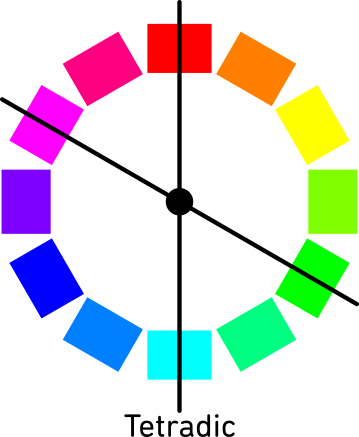
Tetradic :
A tetradic color palette uses four colors that are positioned on the corners of a rectangle on the color wheel. Or in other words, two pairs of complementary colors. In illustrations, a tetradic color palette can lead to interesting and diverse compositions but in a data visualization the multitude of colors might be distracting.
With four hues (and all their variations) it is easy to make a tetradic design look cluttered. Since you have a large variety of colors, you might need fewer variations in terms of saturation and value to complete the design. I particularly love pastel versions of tetradic colors, this makes the palette a bit calmer and helps ensure that the design doesn’t become overwhelming.
Analogous:
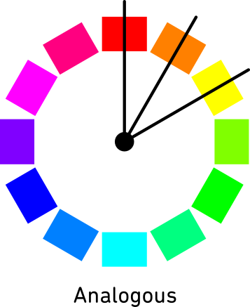
The analogous color harmony combines a color with its nearest neighbours on the color wheel. This creates a set of colors with low contrast in hue that is calm to the eye and feels harmonious. Since there is no large contrast in hue, you will have to work with value and saturation to create contrast instead. Make sure to use darker and lighter versions of all colors to show hierarchy and add depth to your design
The analogous color harmony combines a color with its nearest neighbours on the color wheel. This creates a set of colors with low contrast in hue that is calm to the eye and feels harmonious. Since there is no large contrast in hue, you will have to work with value and saturation to create contrast instead. Make sure to use darker and lighter versions of all colors to show hierarchy and add depth to your design
Some final words
Color theory is a handy tool and now that you know how to wield it better, you are closer to color success! Just remember to consider function, value, saturation and ratios. However, it is equally important to allow yourself to be flexible, don’t take the positions on the color wheel too precise and if you need to add an additional color, allow yourself to do so. Color theory is a tool, not a law. Use it to inform decisions but don’t be constrained by it.
