Choropleth maps are statistical thematic maps where we use variations in color to represent our data, and can be a powerful tool that allows us to show a lot of information in just one visual. These maps are especially common in the various branches of social sciences, as they make it easy to show the geographical location of the study subjects/participants and one (or two) associated variable(s). In this post, we use a map of Europe and data from the European Commission as an example of best practices when it comes to choropleth maps, including how to:
– Declutter the map
– Choose an appropriate color palette
– Know when a choropleth is the best choice (and when it's not)
Decluttering the map
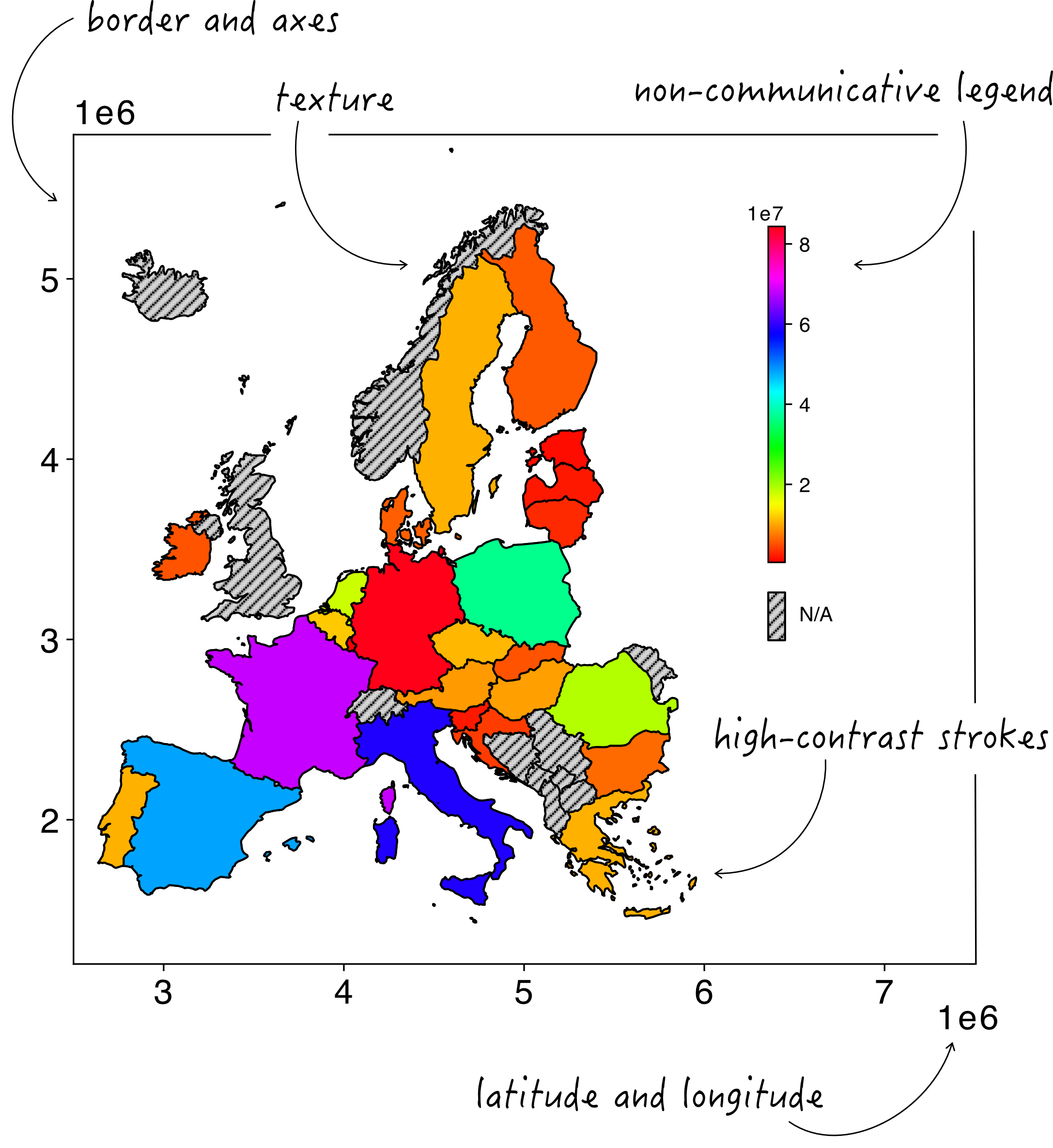
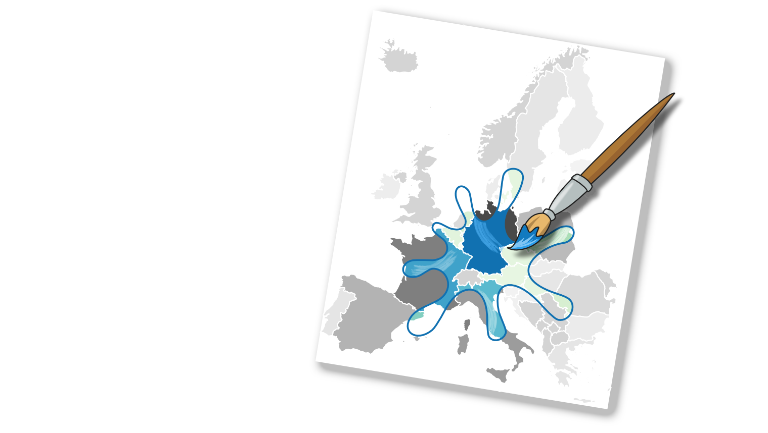
When our code or data analysis software initially produces the choropleth, various elements are included which do not add relevant information, but often just clutter our visual element. This can of course vary across different software and programming languages, but common examples include frames, latitude and longitude axes, color palettes which are often not best suited for our data, and unintuitive labels. These, in addition to common mistakes such as textured fillings, can make our map more difficult to read, like this map below.
There are a few steps we can follow to improve this visual:
There are a few steps we can follow to improve this visual:
1) Remove unnecessary elements. Just as in most other graphs and visuals, we do not need the top and right axes, which just “box up” our data. Unlike physical or topographic maps, in choropleth maps, coordinates are also not a necessary element, as we are generally not interested in the location of our area compared to the rest of the globe.
2) Either completely remove or tone down the appearance of the black stroke around the mapped areas. The stroke is often a distraction with very sharp contrast to the fills of the areas and by choosing a thinner stroke thickness, a softer color, or by simply removing it, the focus will be on the colored areas and not on the strokes between them.
3) Make your labels communicative and self-explanatory, by making sure to use natural data increments/intervals (e.g., 10-20-30-… as opposed to 12-24-36-…), and use clear legend titles and units of measure.
4) In almost all cases, it’s a good idea to make the text larger (for instance, 10pt is a good font size for a figure that will end up in a paper).
What about colors?
5) Remove any textured filling and instead assign a neutral, light color to areas for which we do not have data to show (if any).
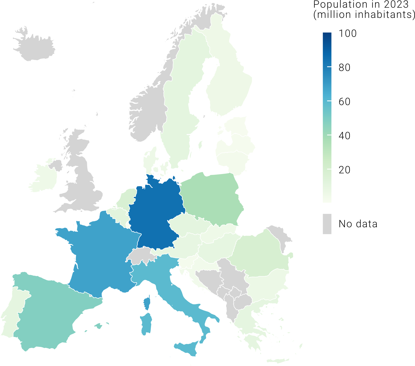
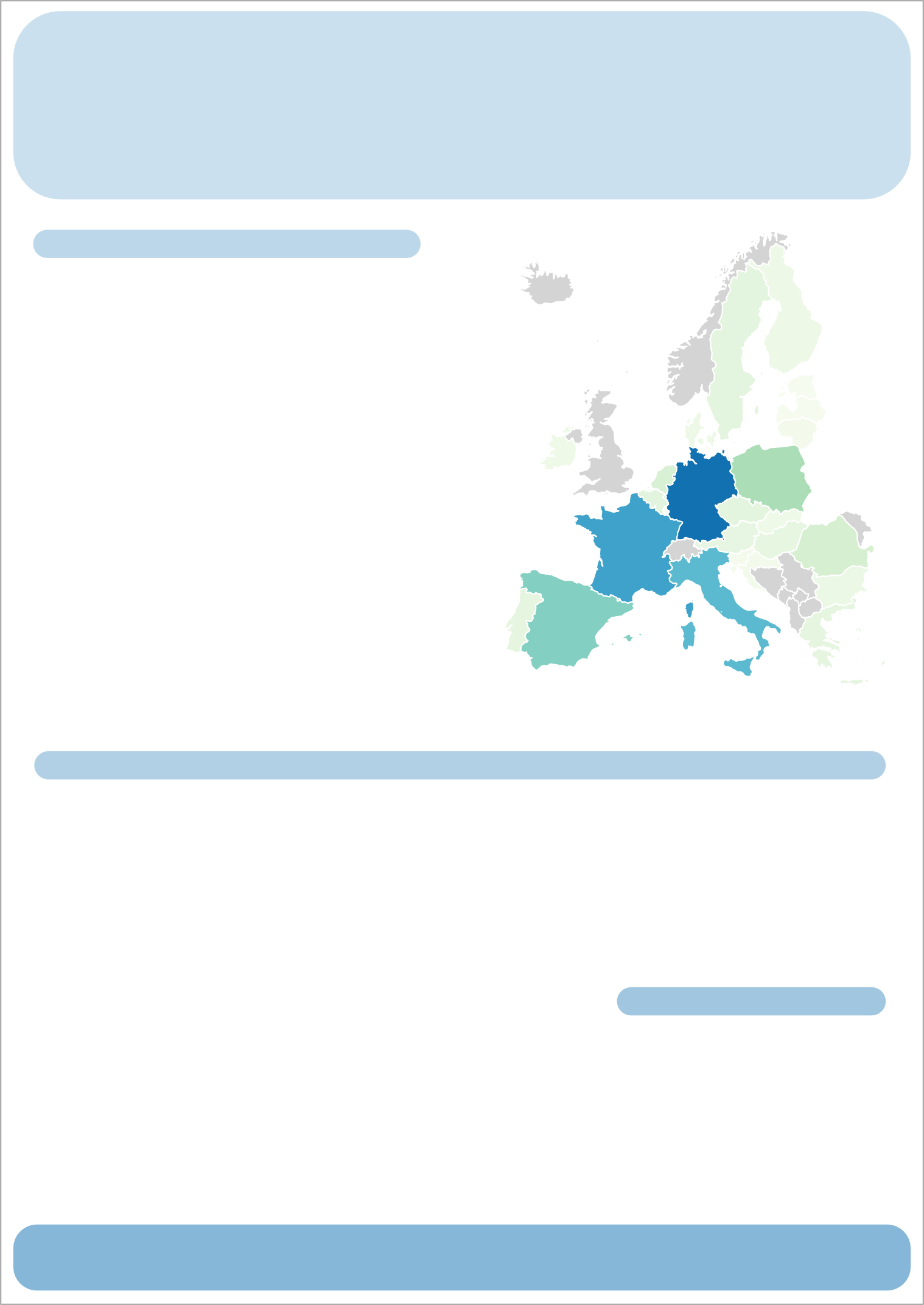
6) Think about what the best color palette is for your data. In this case, because we are showing each EU country’s population, which is discrete numerical data, a continuous palette is a good choice.
After following these simple steps, we should end up with something like this:
After following these simple steps, we should end up with something like this:
Choosing the most appropriate color palette
When choosing the color palette, we should pay attention to a few things. For instance, is our data continuous, categorical, or ordinal? Is our data divergent (i.e. do we have a meaningful middle point from which we go either up or down)? Is the variance in our data high? Let’s have a look at how to adapt your color palette depending on the characteristics of your data.
Continuous color palette
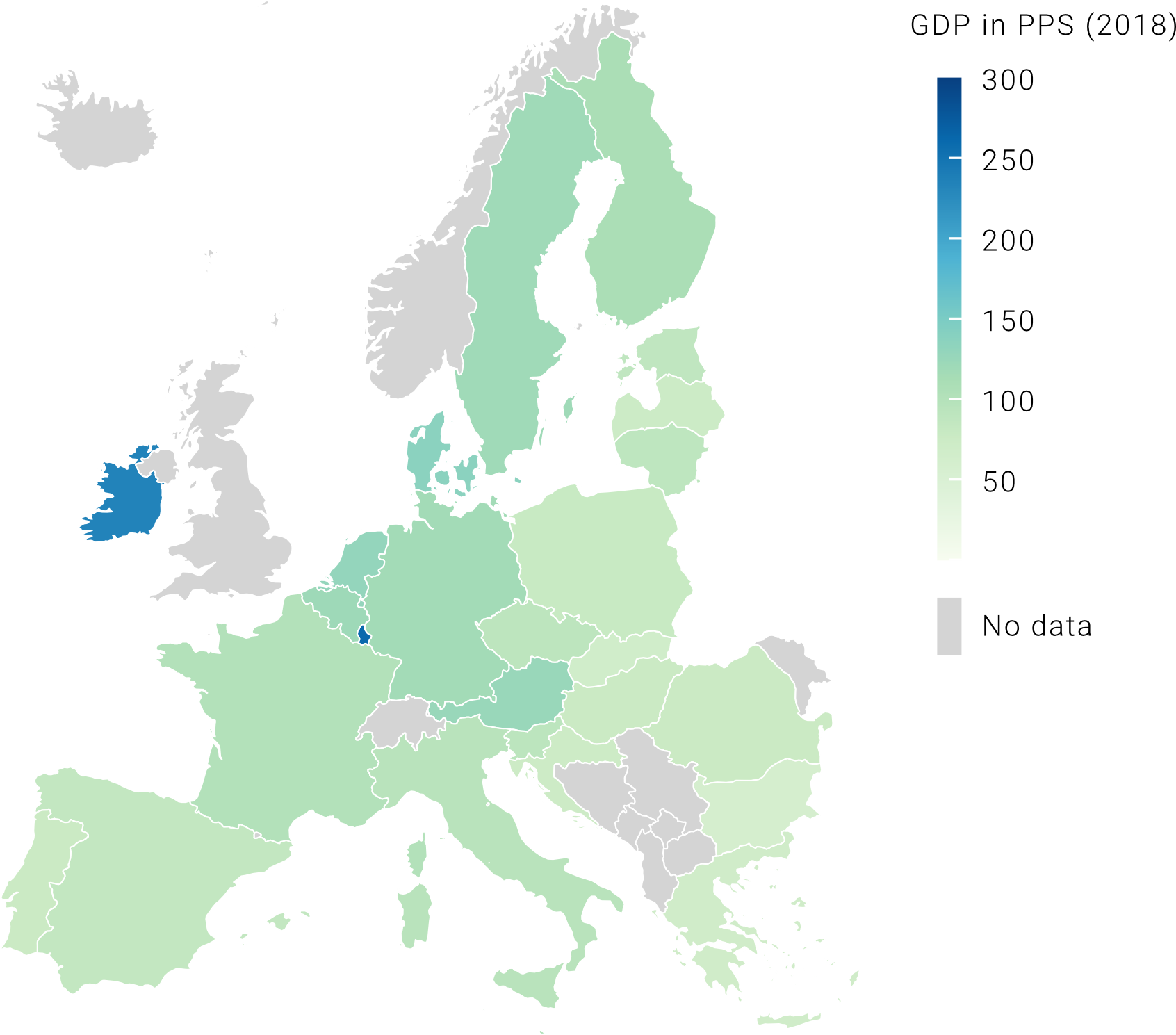
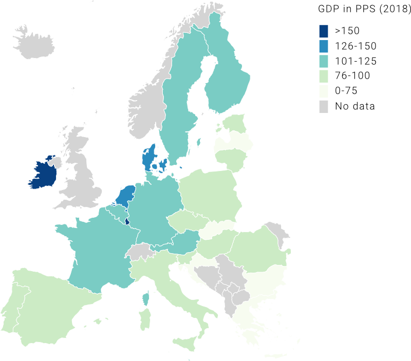
In the example above, we chose a continuous color palette to show the difference in population size among EU countries (check out all the Matplotlib color palettes). In that case, the choice worked well because we had high variance in our data, meaning that values in our data series were quite spread out from the series’ mean. But what happens if our variance is low? The map on the left below shows EU countries’ GDP in PPS (purchasing power standard). You can see that this map is not very informative as it gets difficult to assign these similar shades of green to an accurate value on our 0-300 scale. This issue is caused by the presence of outliers, which are data points that differ significantly from all the other observations (in our case, Ireland and Luxembourg). Because they are on the upper end of the scale, all the other values get “squeezed” in the middle of our color palette. To get around this, we can assign our values to ordered bins (or categories), so that it becomes easier to compare countries among each other. Note that these representations are both correct, the difference stands in what you want to communicate. If your goal is to show that Ireland and Luxembourg have a much higher GDP than the rest of EU countries, then the map on the left is the best choice, while if you want to give a general idea of differences in GDP among countries, then the map on the right is best.
Divergent color palette
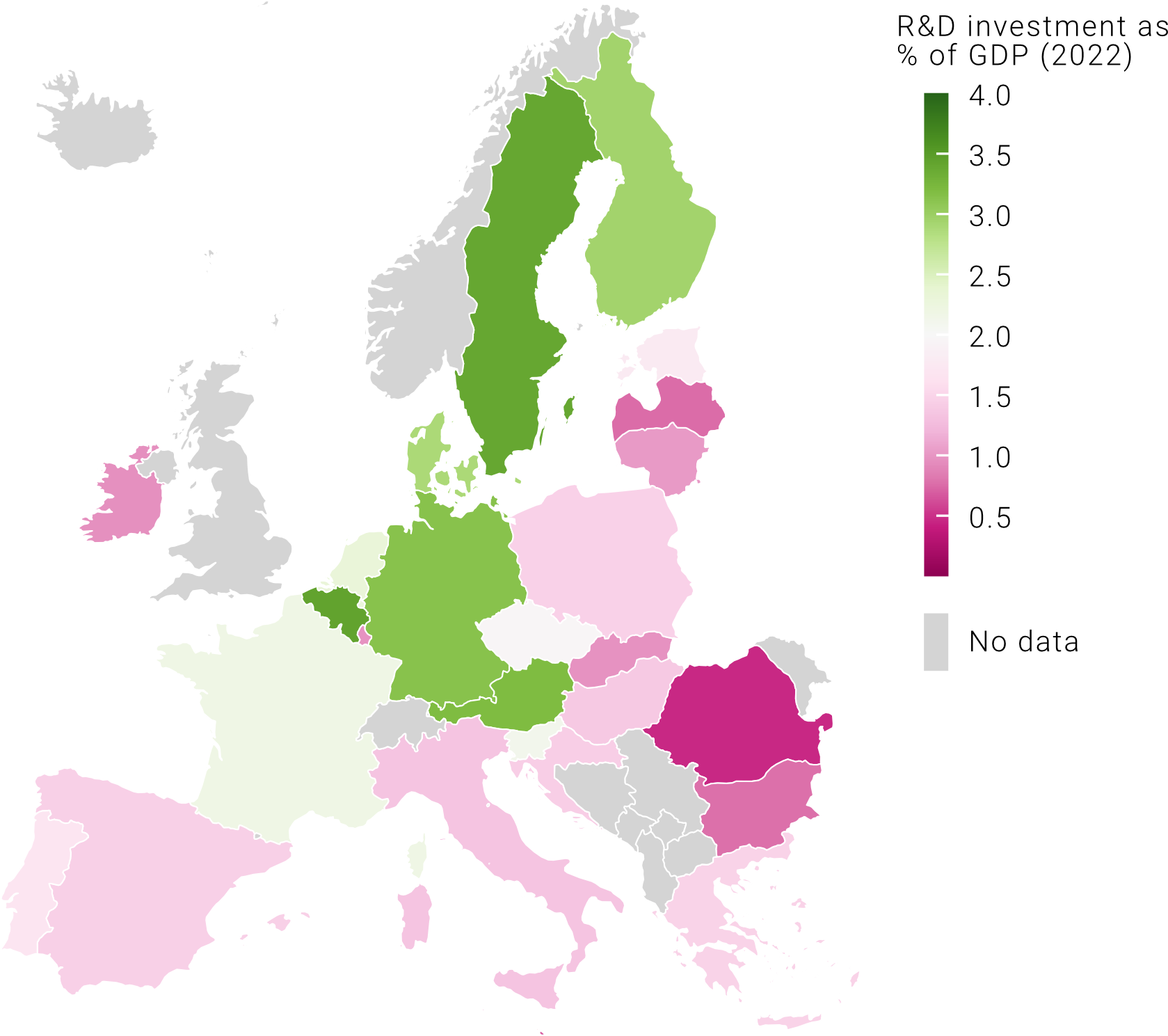
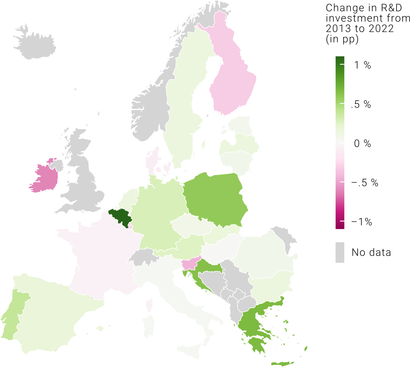
What should we do when our data is distributed in a way where we have a meaningful middle point, often zero, and values both above and below that? These types of data sets are called diverging and, in these cases, a continuous color palette, while respecting the progressive nature of our data, does not visually communicate the concept of “above and below”. Here, we are better off using a divergent color palette where the center point is coded with a light color, or even white, and two additional colors that become more intense as we move away from the center point. Let’s have a look at the map below. When we show the R&D investment as a percentage of the country’s GDP, the divergent colors palette does not work well because it is not intuitive to show a progressive scale with divergent colors (unless, of course, we want to highlight those countries where R&D expenditure is below 2% of GDP, the “zero” value). If, instead, we show the change in R&D as % of GDP in pp (percentage points), the divergent color palette highlights immediately those countries where this increased and those where this decreased.
When is a choropleth the best choice (and alternatives)
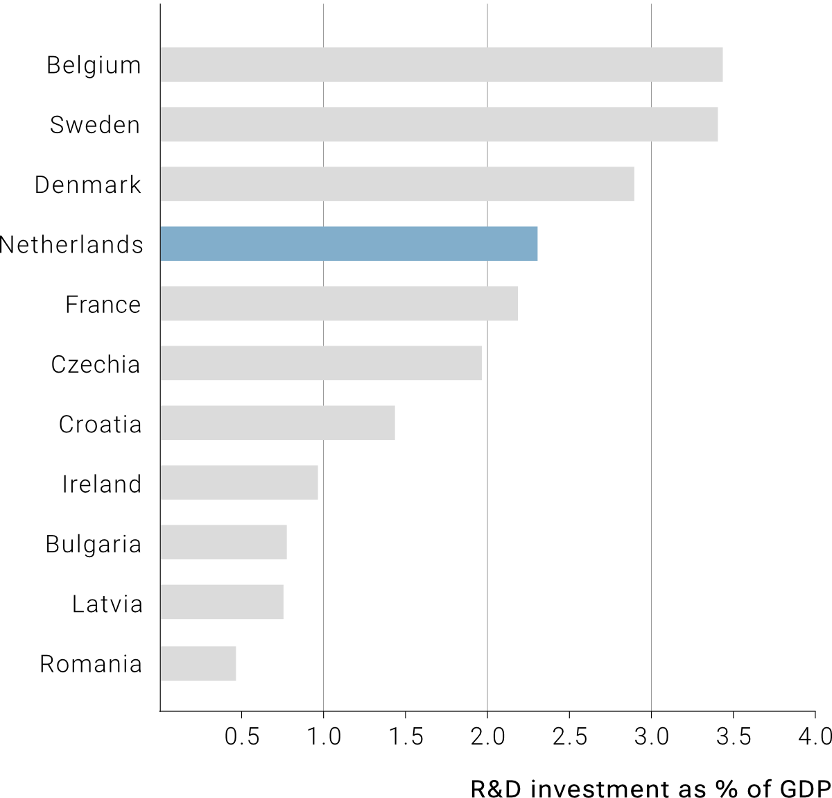
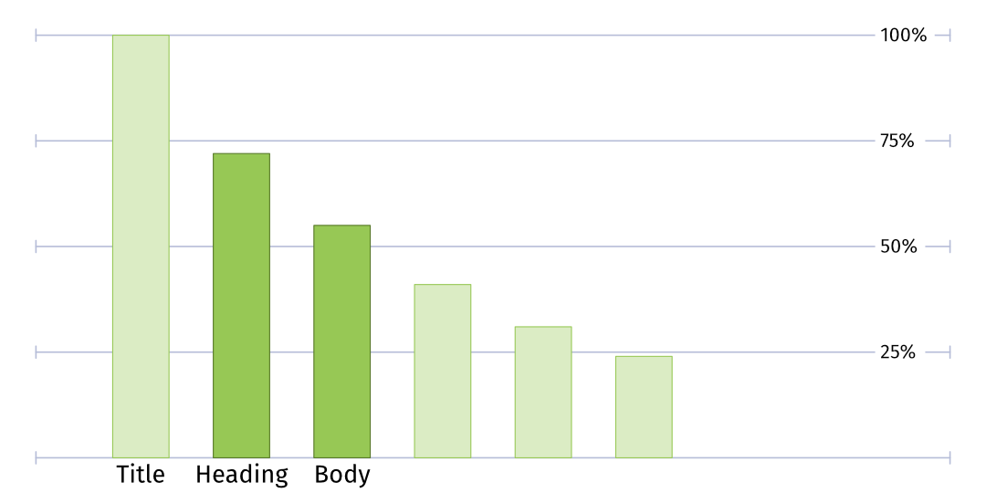
If you are a map enthusiast (like me), using a choropleth map to visualize your data may be your primary choice. However, from a data visualization point of view, there might be better alternatives depending on your communication goals. For instance, if your goal is to show which the areas with the highest/lowest value in certain variables are, a bar plot might be your best option, as we can order our areas in an ascending/descending order. Besides, a bar plot allows us to remove color-coding entirely, and instead we can use color to highlight specific areas (depending on our research or communication goals). Keep in mind that it is much easier for our eyes to spot differences in bar size than color differences in a map.
