Creating
clear and effective charts is crucial for presenting data, but it’s easy to
make mistakes that can confuse your audience. Here’s a recap of our 9 tips from this summer to
keep your charts sharp and easy to understand:
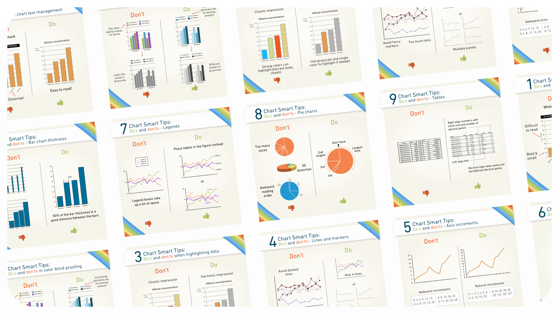
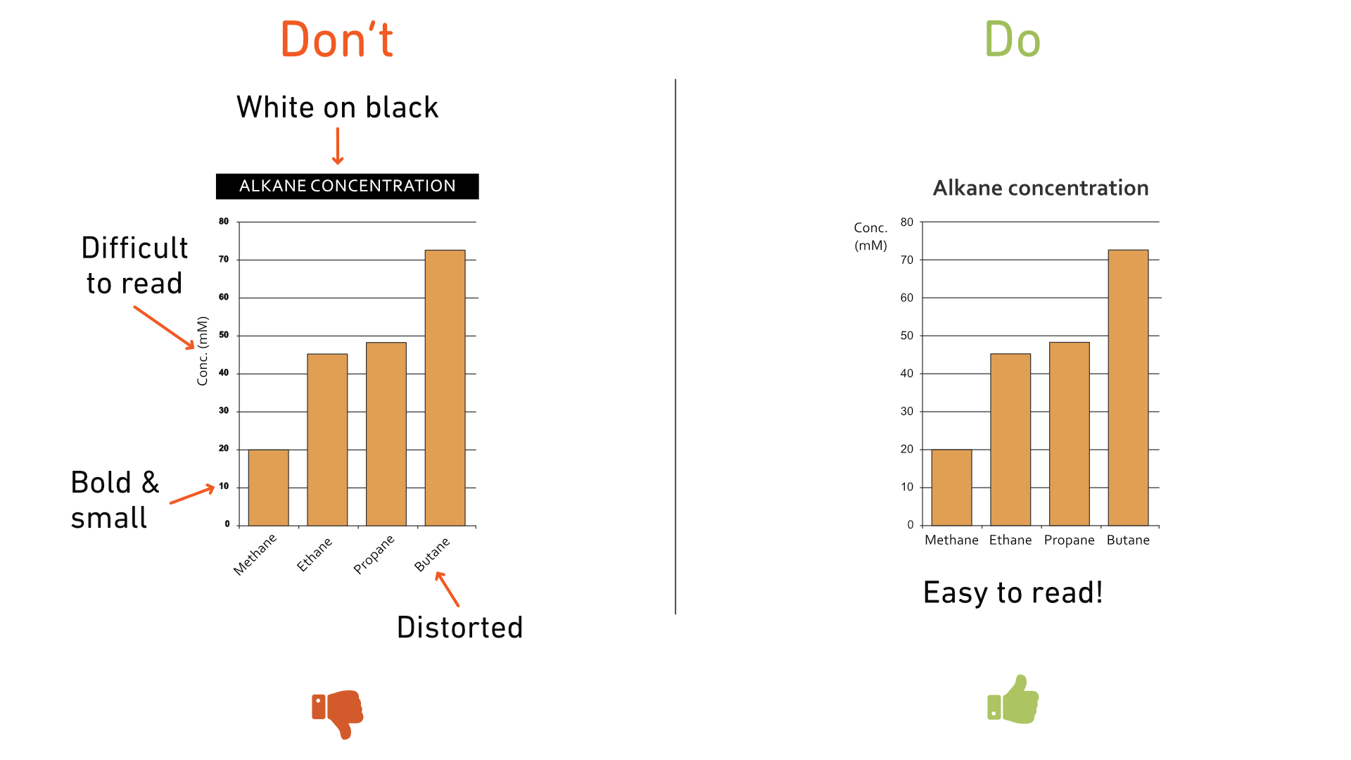
Tip 1: Text in charts
When
adding text to your charts, steer clear of these common pitfalls:
- White text on a black background
- Tilted vertical text on the y-axis
- Small or bold text on the axis
- Sloping x-axis name
Tip 2: Color considerations
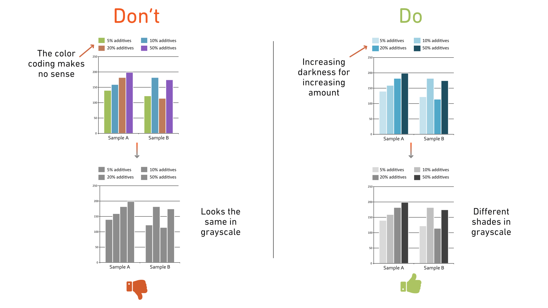
Using color effectively can greatly enhance
the readability of your charts. However, it’s important to ensure that your
color choices are accessible to everyone, including those with color vision
deficiencies. Here’s how:
- Use distinguishable shades that are easily visible even in grayscale.
- For increasing data categories, avoid using different colors. Instead, opt for a single color that varies in intensity as values increase. This approach ensures clarity for all viewers.
Tip 3: Highlighting specific data sets
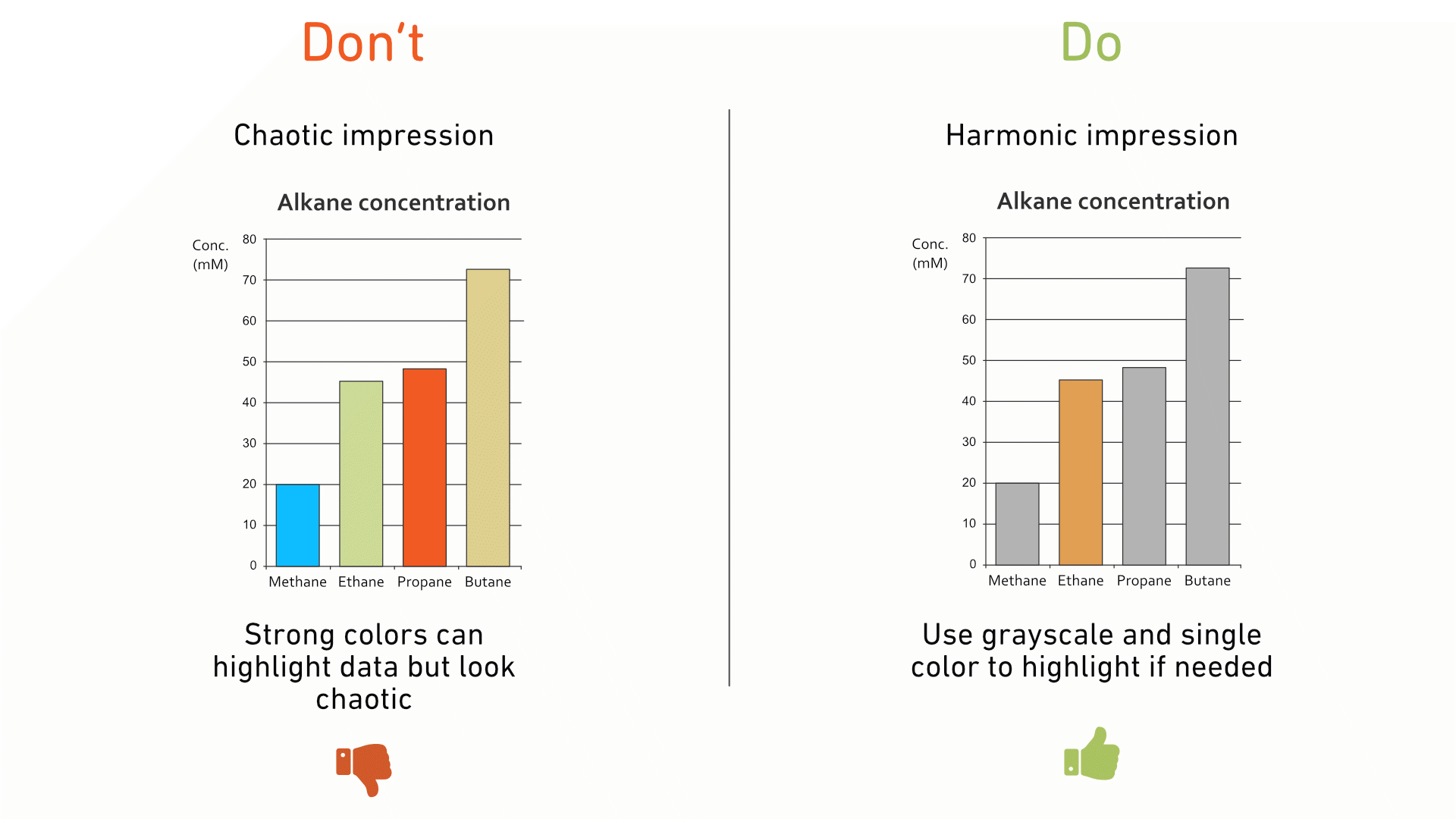
When
you want to draw attention to a particular data set, it's better to use a
grayscale palette for all other data sets. This prevents distractions and keeps
the focus on the data you want to highlight.
Tip 4: Lines and markers
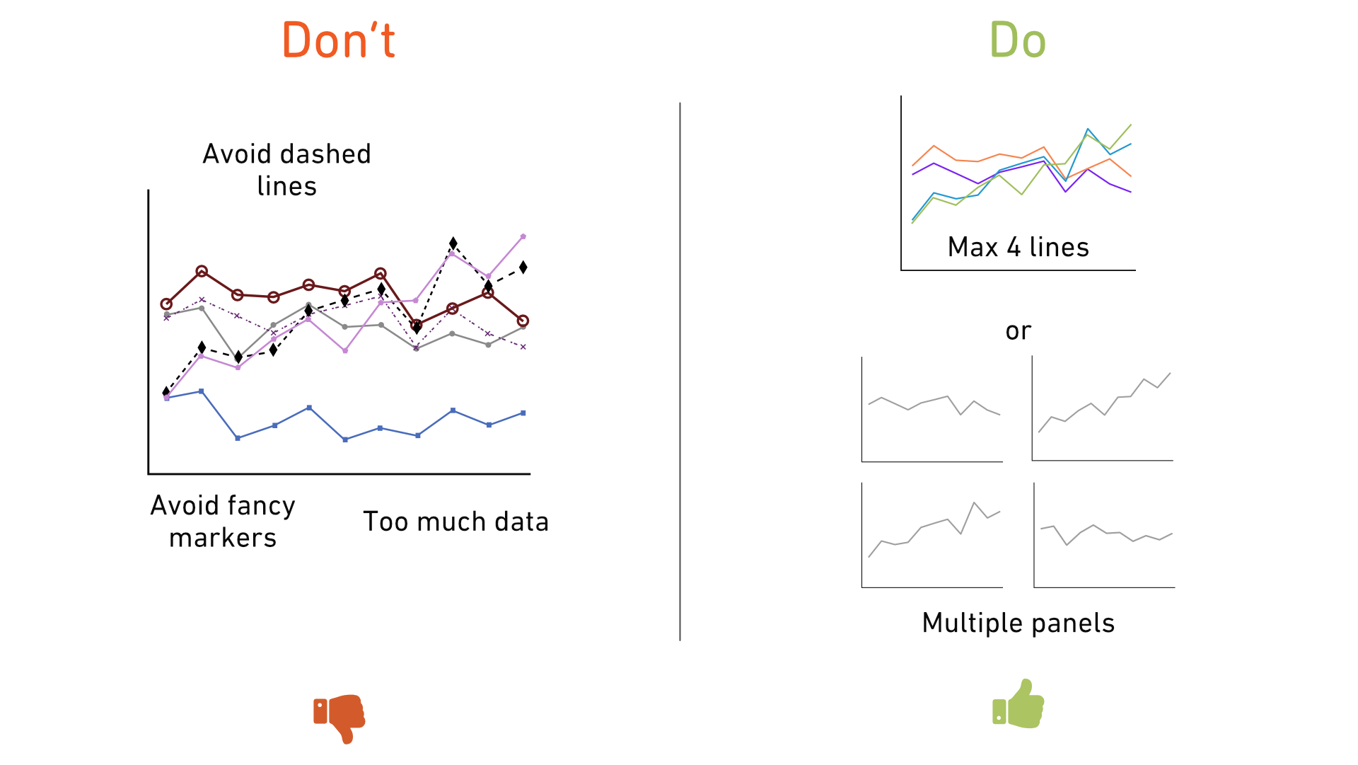
Multiple line charts in one graph require
careful attention to maintain clarity. Here’s what to avoid:
For best results, limit your chart to four lines and consider using multiple panels if necessary.
- Dashed lines, as the differences between dash styles can be hard to distinguish.
- Fancy markers, which can obscure data points and make them difficult to spot.
- Too many lines in a single chart,
especially if they overlap significantly and individual positions are
important. (If overlapping is intentional and informative, then including all
lines in one chart is appropriate.)
For best results, limit your chart to four lines and consider using multiple panels if necessary.
Tip 5: Axis increments
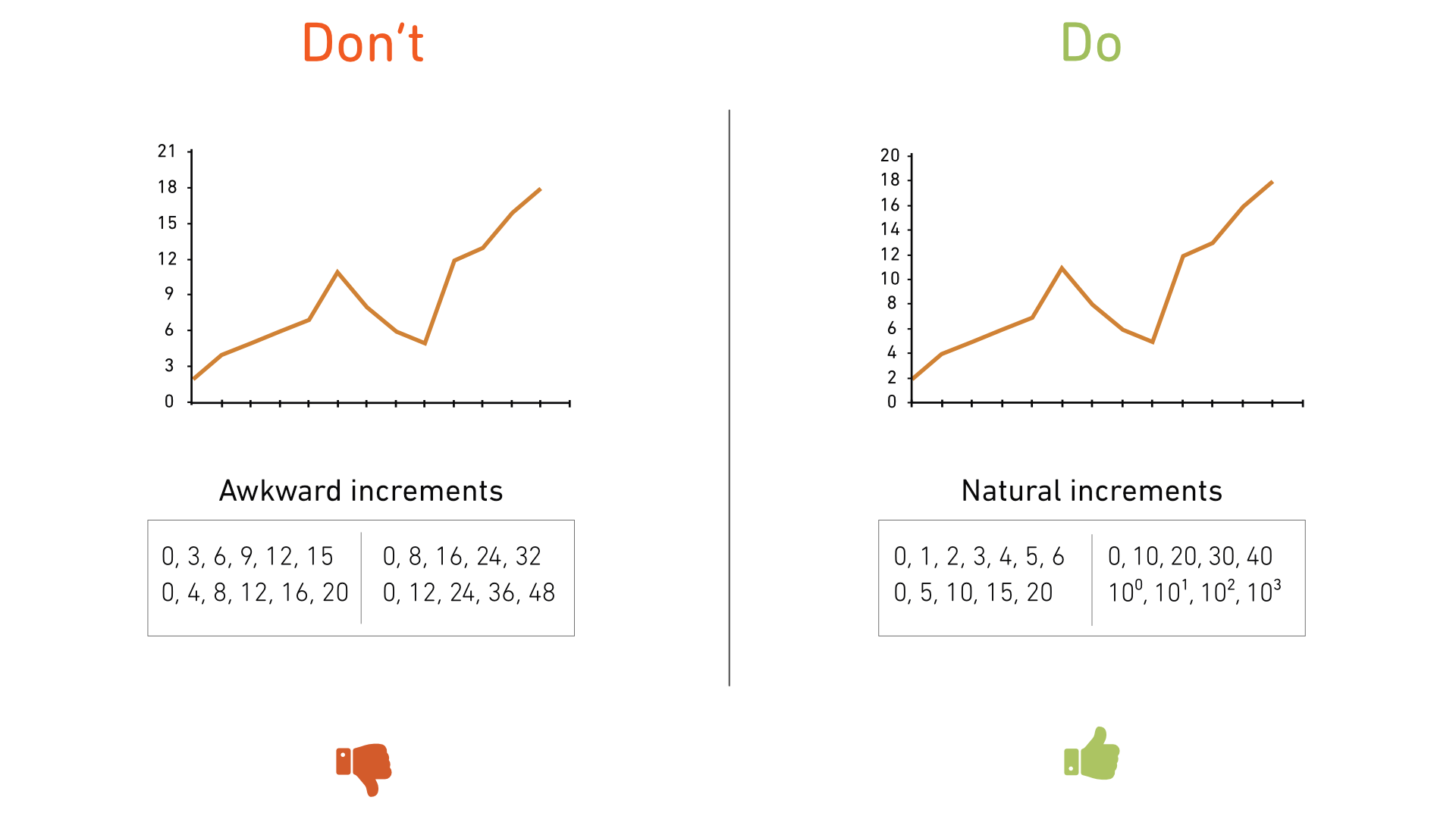
Charts
are easier and faster to read when the axis increments follow a natural
progression. This is something we often overlook, defaulting to whatever
increments the software provides. Take a moment to adjust these increments for
better readability.
Tip 6: Bar chart thickness
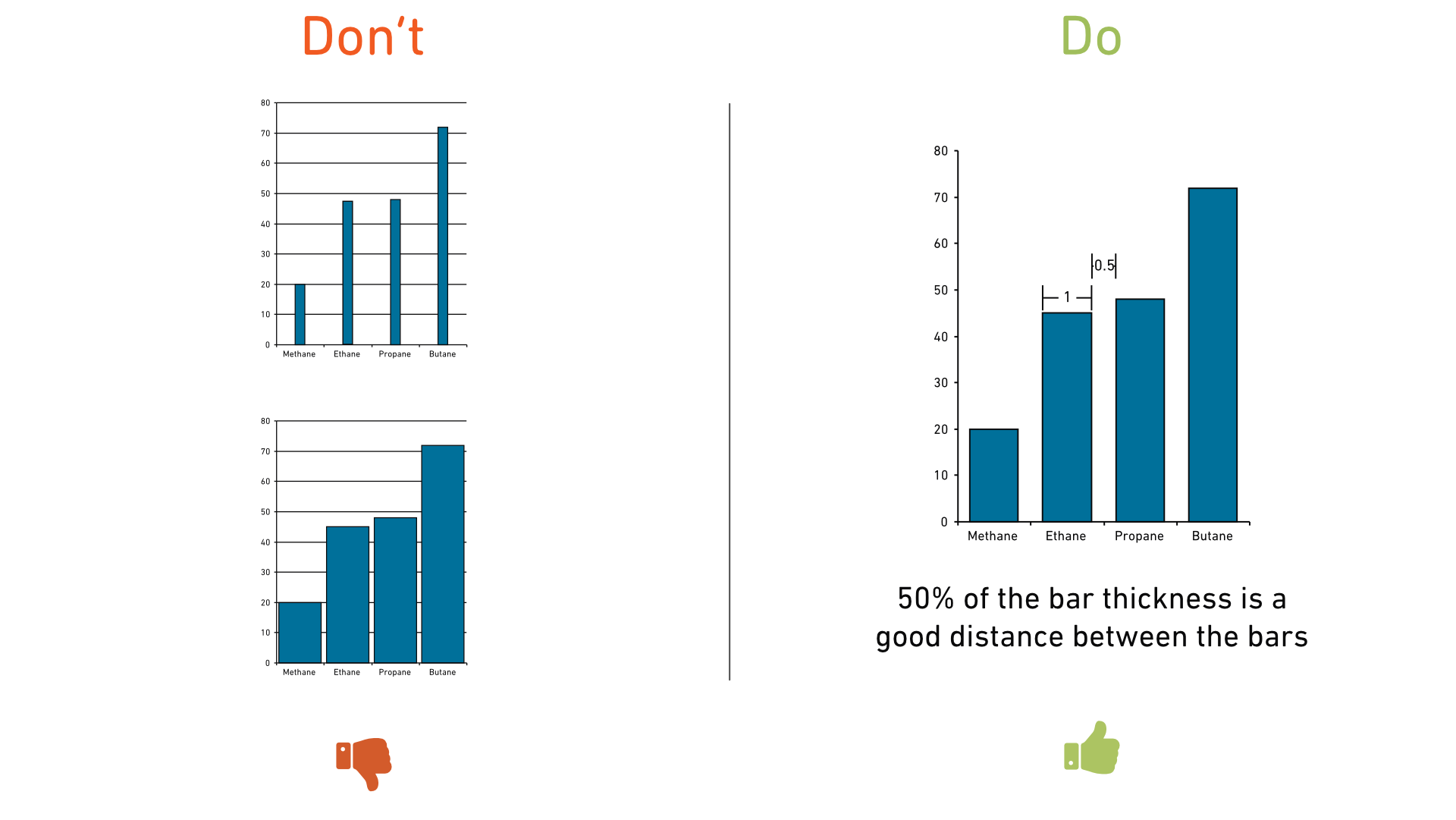
In bar charts, quick comparisons of bar heights are essential. To achieve this:
- Avoid making bars too thin and spaced too far apart, as this makes them hard to compare.
- Don’t make bars too wide or too close together, as they become difficult to distinguish.
- Adjust bar width based on the available space, and set the distance between bars to about half of the bar width.
Tip 7: Rethinking the legend
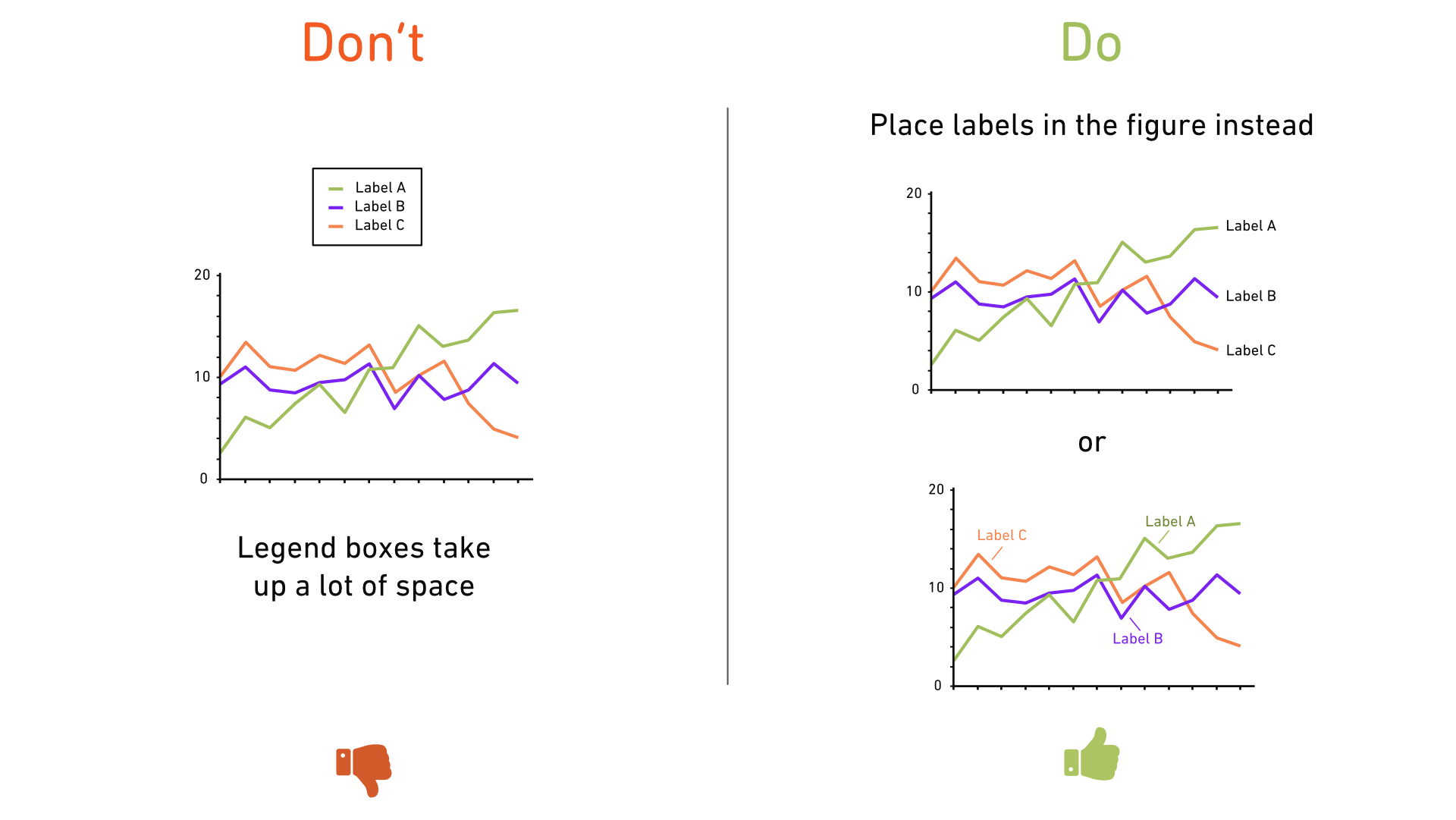
Default
legends can be bulky and take up unnecessary space. Instead, try integrating
data labels directly into the chart. This not only saves space but also makes
it quicker for readers to interpret the data.
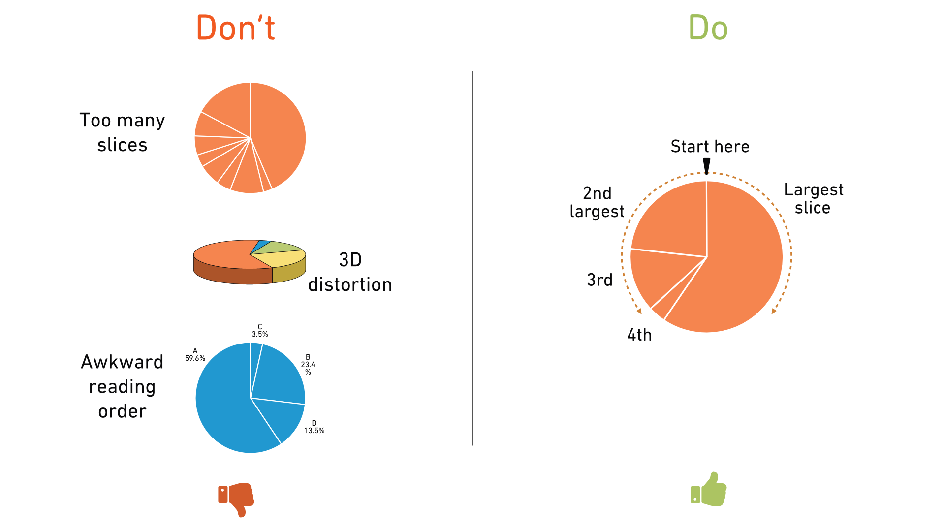
Tip 8: The right way to use pie charts
Pie charts can be effective for showing fractions of a whole, but they’re often misused. Follow these guidelines:
- Limit your pie chart to 4-6 slices maximum.
- Avoid using effects like textured fill colors or 3D distortions.
- Start with the largest slice at the top right, followed by the second-largest on the left, and continue adding slices below.
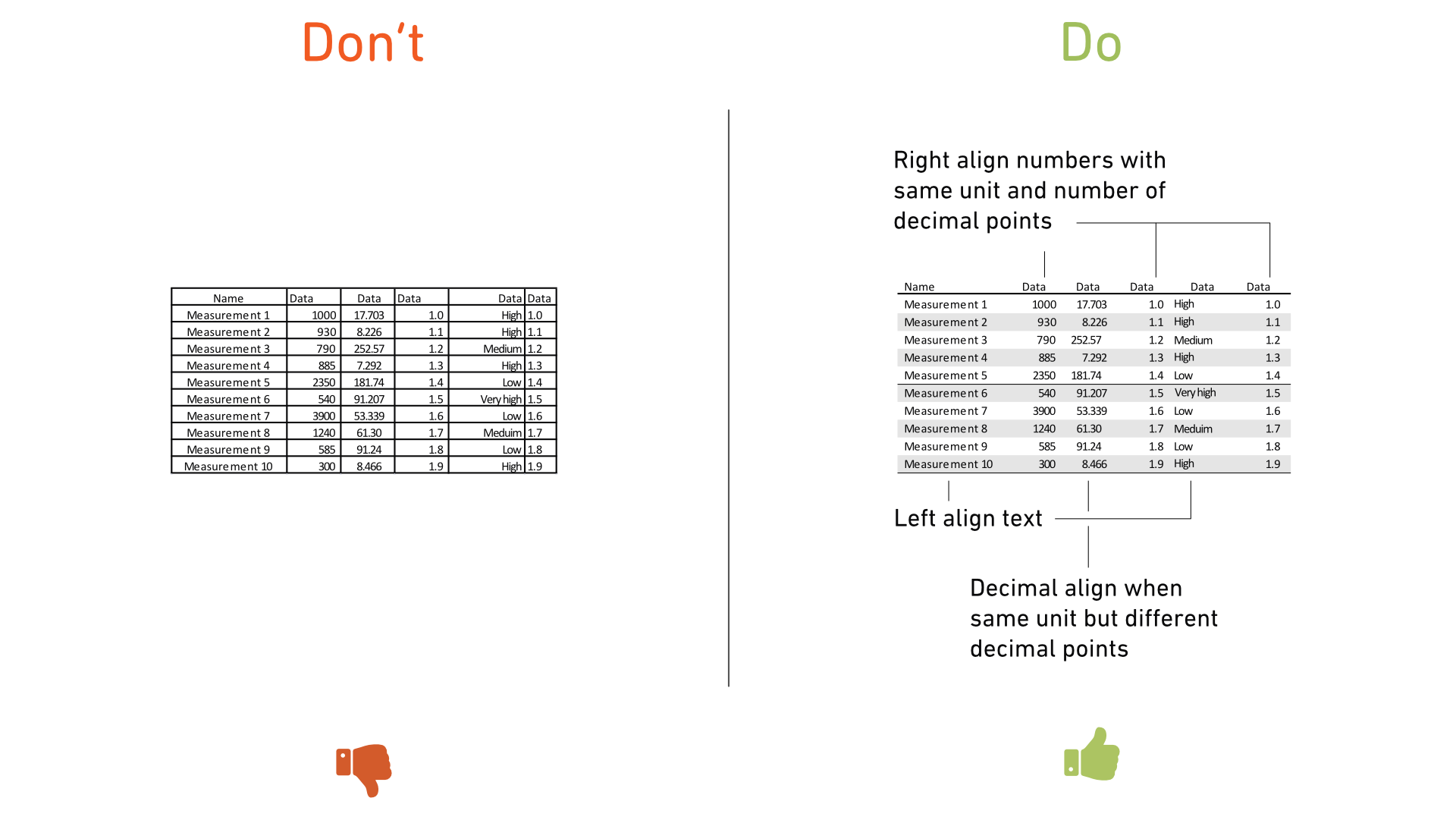
Tip 9: Improving table design
Default table designs often present data in rows without emphasizing readability. To enhance clarity:
- Remove unnecessary lines and use background fills on alternate rows for better readability.
- Left-align text, right-align numbers with consistent units and decimal points, and use decimal alignment for numbers with varying decimal places.
By following these tips, your charts will be more accessible, easier to understand, and visually appealing to your audience. Good luck with your designs!
